A little bit about me
Welcome to my design portfolio.
A fast, accurate designer with a sharp eye for detail, highly creative thinking and an almost obsessive level of organisation.
A clear, confident communicator and negotiator who works effectively with both clients and colleagues.
Adaptable, enthusiastic, dedicated and passionate - with a consistently positive, good-humoured approach.
View some of my work
Discover my collection of creative work and visual projects. Each piece showcases my design style
whilst reflecting the needs of the client and their target market.
Mattioli Woods Branding & Guidelines
I was asked to look at the branding for Mattioli Woods. I focused on evolving the visual identity while preserving the familiarity and trust the company has built with its many investors. My aim was to introduce a refreshed, modern look that reflects the firm’s continued growth, without losing the heritage and recognisability that clients value. This balance between innovation and continuity was central to the redesign, ensuring the brand feels both renewed and reassuringly consistent.
Birds Eye Hasbro Promotion
Birds Eye partnered with Hasbro to offer shoppers the chance to receive one of Hasbro’s iconic games for free with the purchase of selected Birds Eye products. The campaign was designed to bring families back together around the table — not just for mealtime,
but for fun time too. By combining good food with classic family games, the initiative encouraged moments of connection,
laughter, and shared experiences.
Ironstone Bank Branding
Weatherbys Bank were launching a new arm of their business aimed at supporting smaller investors. The initial creative direction explored themes connected to the bank’s rich horse-racing heritage, drawing on the legacy that has long defined the Weatherbys name. However, as the development progressed, the decision was made to move away from these cues in favour of a fresh concept inspired by Ironstone -
a material locally sourced in the region around the bank’s headquarters. This new direction offered a grounded, authentic connection to place, providing a distinct identity for the venture while still aligning with the bank’s longstanding values of stability and tradition.
Birds Eye Chips
I was asked to create a launch campaign for the new Birds Eye Chips, with a brief that encouraged us to push the envelope and position the product as a genuine challenger for the No.1 chip brand. Our initial concepts confidently delivered on that ambition, presenting bold, impactful ideas that matched the scale of the challenge. However, as is often the case, the client ultimately chose to pull back and pursue a more conservative and less impactful direction - the version shown on the first slide. Despite the shift, the process showcased the strength of the original creative thinking and the potential for Birds Eye to make a bigger statement in the market.
Birds Eye Mini Fish Fingers
I was responsible for designing the key visual and on-pack lock-ups for the Birds Eye Mini Fish Fingers “Free Mini Captain” promotion. This included developing a special-edition slip case for the accompanying Playmobil box, ensuring the promotional branding was cohesive, appealing, and aligned with both brands. In addition, I created comprehensive toolkits tailored for the UK and wider European markets, providing clear guidance and adaptable assets to support consistent execution across all regions.
Leicester Comedy Festival
I designed the programme cover for the 2025 Leicester Comedy Festival’s Gala Preview Show, inspired by my concept of using rubber ducks, formed to look like local celebrities, as a playful nod to the local phrase, “Ey up me duck!”
The idea was so well received that the festival is continuing the theme for 2026, where I developed the theme of “The Art of Comedy”
and a series of famous artworks reimagined with duck faces to bring a cheeky, comedic twist to the campaign.

Princes Tuna
was asked to create a promotional advert for Princes Tuna to support a competition offering a trip to Mauritius. To elevate the concept,
I pushed beyond the brand’s typically restrictive creative boundaries, placing the tins within an idyllic holiday setting that captured the spirit of the prize while still staying true to the brand’s identity.

Mars Wrigley Celebrations
In 2024, we created the campaign for Mars Wrigley’s Celebrations 500,000 Golden Ticket promotion, which proved so successful that the brand expanded it this year into a 1 Million Winning Ticket campaign.
I was tasked with developing concepts that would elevate the idea to the next level, building on the original success while introducing fresh, impactful creative directions to maximise excitement and engagement.
Crisp'N'Dry
Crisp ’N’ Dry asked me to explore ways to highlight the versatility of a product often seen simply as cooking oil. To shift this perception, I developed a creative approach that showcased its use across a wide range of cooking styles, with interchangeable headlines tailored to the accompanying imagery. The one constant throughout was the sign-off line: “Whatever you try, Crisp ’N’ Dry.” Several additional creative routes I developed during the campaign exploration are also shown here.
Birds Eye Chicken Shop
Birds Eye launched eight newly revamped products to increase market appeal in the fakeaway category along with a packaging re-design and wanted us to help them to accelerate in-store engagement.
I created a selection of concepts that ranged from the irreverent to the simple yet attention-grabbing. The final key visual leaned into the look of takeaway chicken outlets with a tiled backdrop and classic neon sign. Bringing the food shot front and centre adds to the desirability of the food. I signed off with ‘A Flavour Explosion in your freezer 24/7’ to remind the consumer of the constant availability in comparison to a takeaway. I also created concepts to work for different retailers. In Iceland we created an out of store takeover.
For Tesco we gave the shoppers a Shop-in-Shop experience.
Each retailer had a unique experience, but a common thread ran through all to maintain a cohesive campaign. Each concept revolved around a real chicken shop experience with menu screens displaying the different products and potential meal deals.
Mars Wrigley Protein
I was asked to step outside the usual brand guidelines for Snickers and Kind to develop a Protein Bar campaign designed specifically for petrol stations and motorway service areas. The aim was to create bold, attention-grabbing concepts that spoke directly to on-the-go consumers. These are just some of the creative routes we presented.
Jordans Buyer's Box
I am often asked to create ‘Buyer Boxes’ - special presentation boxes sent to retail buyers to help sell in a brand’s new product. Over the years I’ve designed many of these for brands such as Jammie Dodgers, Dolmio, Ben’s Original, and most recently Jordans Granola Thins. For this project, the client wanted the box to resemble a satchel, so I designed all the elements needed to give it the look and feel of an authentic leather bag.


Birds Eye Captain's Discoveries
Birds Eye were launching a new fish range aimed at more discerning tastes, inspired by recipes from around the world. I developed the key visuals for the campaign, capturing the premium, globally inspired positioning of the product. These visuals were then adapted across
in-store point-of-sale materials to create a cohesive and engaging shopper experience.


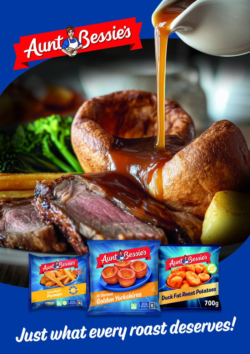
Aunt Bessie's Roast
Aunt Bessie’s commissioned a Q4 campaign that took visual cues from the premium meal shots seen in M&S advertising. To help guide their creative direction, I produced an AI-generated hero image for use as inspiration for their own photoshoot (shown below). I also wrote the accompanying concept copy, which the client loved. Unfortunately, the final photography did not achieve the rich, high-quality look we were aiming for, resulting in food that appeared flat and dry—a disappointing outcome given the strength of the original concept.
Birds Eye Tickled Pink
Having worked on the 2024 Tickled Pink campaign for Aunt Bessie’s, I was asked to develop concepts for Birds Eye Chicken’s contribution to the same charity initiative. Because Birds Eye Chicken products are made with 100% chicken breast, the creative direction felt like a natural fit. The imagery draws from the well-recognised Pink Ribbon motif associated with breast cancer charities, reimagining it as the hand position used for self-checking. The accompanying headline links the product to the procedure in a light-hearted yet respectful way, maintaining both relevance and sensitivity.


If you would like to see more of my work please click the button below to see my archive